
JOE SINK POTTERY

Brand Positioning
Photography + Video
UX Design and E-Commerce
Creative Direction
The Direction
Joe Sink is an incredible potter and friend. I have longed admired his pieces and his modern take on traditional forms. When Joe asked me to photograph his newest works, it opened a door to a much more needed brand update.
Through our conversations, I learned that Joe wanted a more elevated and high-end look to reflect the value of his works, along with a simple product organization and updated webspace.

-
We looked through Joe’s core pieces, his best sellers and those one off bespoke pieces. Our goal was to divide his time between core pieces that he sells a lot of and leave some room for wood-fired pieces and other creative explorations.
One of the key things, was the production time of each product and inventory. We worked on a strategy to keep a certain amount of inventory on core pieces, and leave the seasonal and other pieces in bisque form (the state after firing before glaze).
We also worked on increasing his base price on any bespoke forms or glazes.
-
The creative direction for Joe Sink was to show elevated pieces that reflected the quality and craftsmanship of his work. To do so, we opted for a cream neutral backdrop for all core pieces. This would help him be able to keep consistency throughout.
We also worked on two types of user experience content. One involved showcasing the use of certain pieces in real life homes and the second involved displaying plates and bowls with everyday food or produce in them to correlate size in a real way.
-
Once we re-defined the products and collections, I went about changing each category and applying subcategories for information organization. We made sure language was consistent throughout and that product descriptions were concise, highlighting the main facts that most of his customers search for.
We researched his competitors and created distinct SEO and keywords to increase Serp ranking and discoverability.
Finally we set Joe up to be able to maintain and update his own site. As a small business owner, it is hard to have budget to hire outside for web maintenance.

We Worked On Re-defining And Re-naming Joe’s Core Pieces, Styles And Collections, Resulting In A Streamlined And Modern Presentation Of His Works.
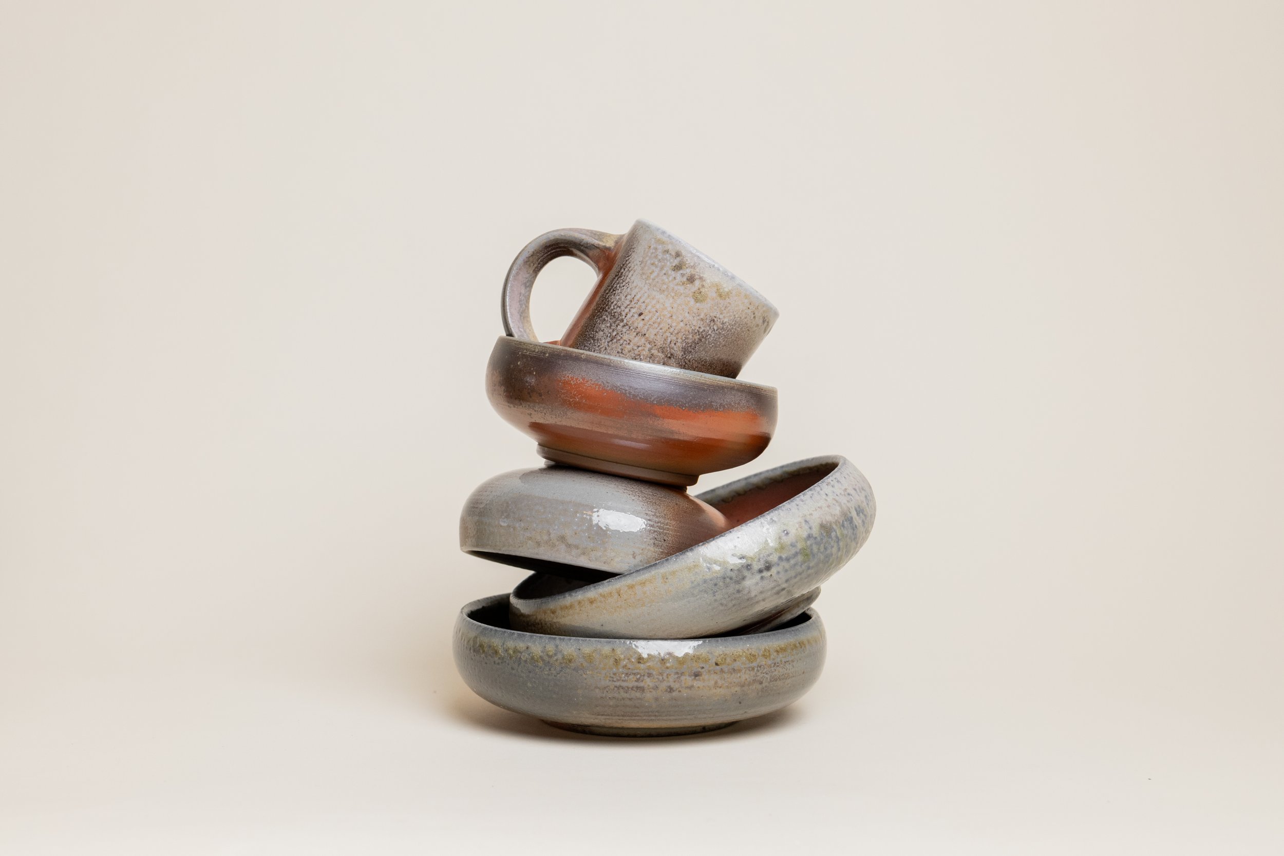
The Wood Fired Collection
A collection dedicated to Joe Sink’s roots in traditional pottery techniques but leaning into a modern palette of warm greys, blues and rust.


The Everyday Collection (Featured Top)
A collection dedicated to the pieces that are used well, everyday. The pieces are meant for any household or style relying on the more classic form of farmhouse pottery.
The Modern Collection (Featured Bottom)
A collection dedicated to Joe SInk’s exploratory pieces where he challenges new shapes and forms for traditional farmhouse pottery.
“We are committed to creating pottery that is of the highest craftsmanship, and every piece is designed with form and function in mind.””

The Story
Joe has such an amazing journey into the world of hand turned pottery and is a very down-to-earth and humble artist. We wanted to capture his story and process to help consumers understand the value of each piece and the time and energy that goes into each creation.
Since Joe already had an amazing brand video, we only had to call out sections in his process.
Visit Joe Sink’s Website
Seasonal Lifestyle Imagery
On two occasions, I styled and photographed a holiday and seasonal campaign to highlight Joe’s new color - Spruce and to bring to front of mind, the wood fired collection.


